Combination of colors in the interior
The color of the walls, furniture, textiles, decor - this, perhaps, is first, what makes you proud to enter a person’s room. Carefully selected, harmonious combination of colors plays a great role not only from an aesthetic point of view. Of course, if “eyes don’t fall” on the track, it’s better to go somewhere more suitable. This also affects the psychological state of the ruler and the guests of the booth.
 Centuries have long brought an influx of colors into the human body. For example, a yellow, orange color in the kitchen awakens the appetite , and in the child’s room it helps develop the child’s creative potential . The red color, however, is not acceptable in a children’s room, as it will dissipate their activity and will encourage them to sleep peacefully .
The vibrant color of the building will visually change the architecture of the room. Decoration in warm colors will provide great warmth, a sense of calm and soft light, while a small range of colors will visually expand a little. When choosing a color scheme for the interior, we first need to respect the target audience, who will live in this room.
 The correct choice of colors is a matter of understanding, depending on the choice, depending on the age and way of life of the rulers of the colors. For example, the bedroom of a young couple can be decorated with romantic russet or red colors, since young people are more active. For an older family, the bedroom is needed as a place for replenishment and renewed energy, which will accommodate the cold noise. Also, in each new season, discover your own trendy colors, which change periodically.
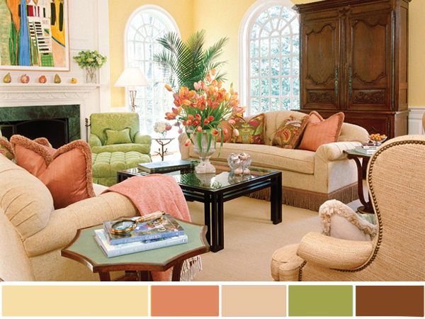
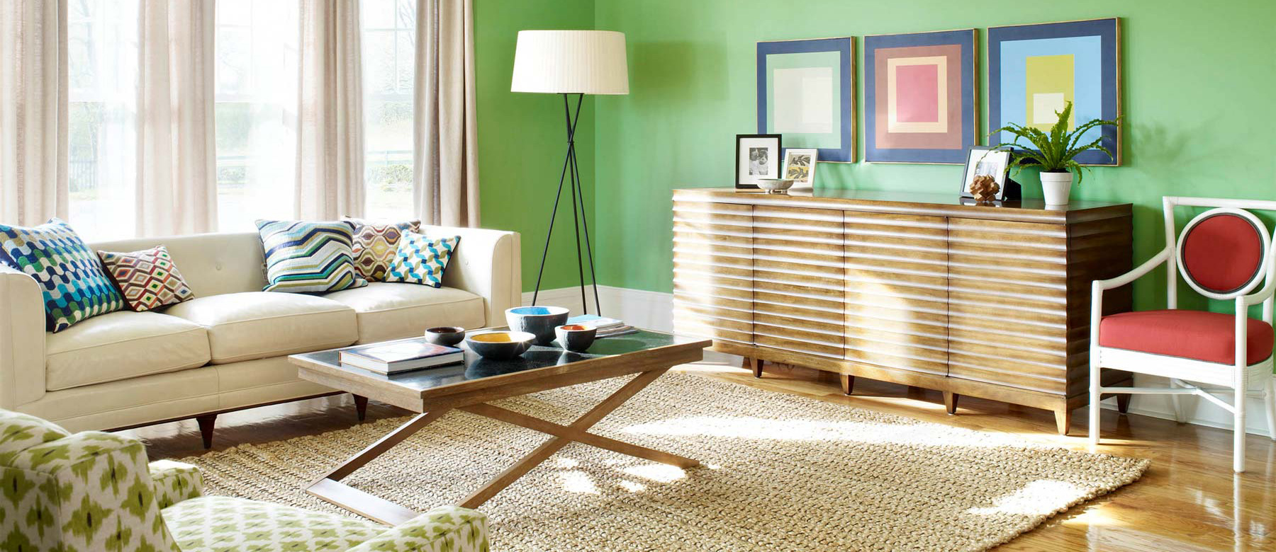
And yet, the designers have created a bunch of rules, and there are a lot of them. One of them is a whole palette : combining several colors at a time, at least one. You can select them based on the following principles: the colors will be contrasting, harmonious, or consistent to the same tone. The remaining option is the simplest, even though it essentially boils down to one color, or more light and dark tones. For example, for the main mint color, you can choose lime and light green.
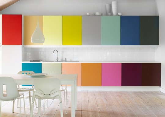
A slightly simpler principle is to select different colors so that they harmonize with each other, but this gives more room for the designer’s creative ideas. The red color of the walls this time complements the orange and yellow ones. Thus, for the design, select a number of colors from one panel.
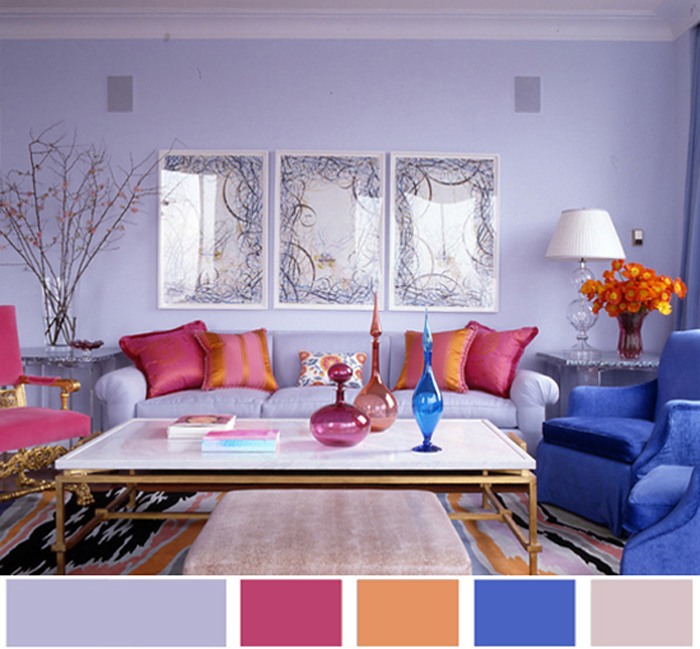
And it’s not easy to play with contrasts; it requires a precise sense of taste and style, but contrasting colors give an original effect. The main rule is to choose the antipode color of your skin. For the yellow one you can use buti buzkoviy, for the green one - chervoniy.
Graphic designers have their own tools with a selection of colors. The most popular of these is Adobe Kuler . In addition to the manual tool for selecting colors for various parameters, there you can also find ready-made color schemes from custom suppliers. The most important thing is to choose the ones you like.
Selecting colors is a much more important process than you might think at first glance. This is the basis on which the design of the accommodation stands. It doesn’t take much time to paint the walls, and changing the color scheme of the room will make it even more complex. A correctly selected color scheme brings comfort and style to the cabin and its inhabitants.
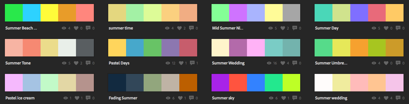
Use colors in Adobe Kuler using “Summer pastel”
- ←Previous news Decowood beams are the best choice for antique decor
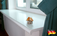
- Next news→ Advantages of Danke window sills
 Window sill Danke
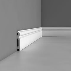 Polyurethane skirting Orac Decor SX137 Flexi
 Cornice flexible profile
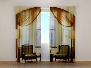 Photo curtains
 Ulf Moritz inserts and elements
 Liquid wallpaper
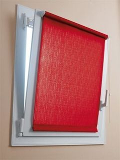 Primehouse ready-made roller blinds
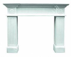 Decorative fireplace Harmony FP1103
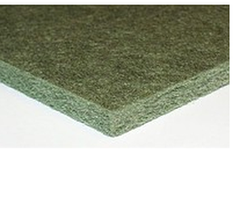 Isoplaat underlay quiet running 5 mm
 Children's
 Decorative beams
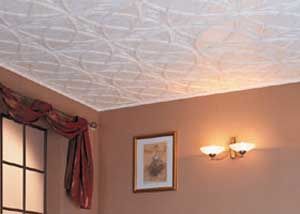 Ceiling decor
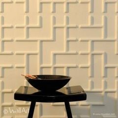 3D WallArt Tetris panel
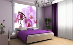 Photo wallpaper
 Moldings